“F” is for Family
“F” is for Family
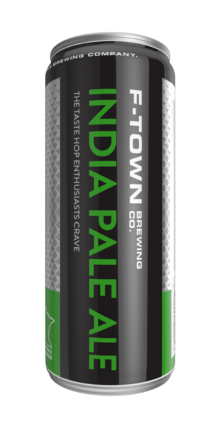
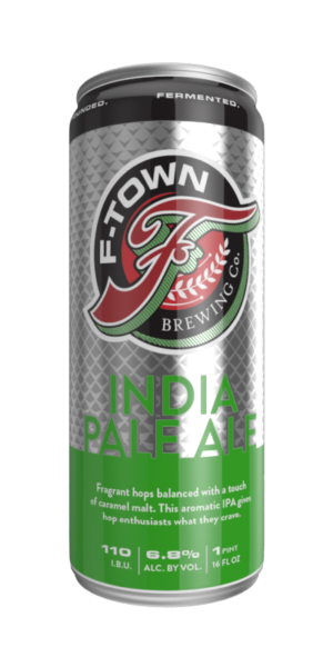
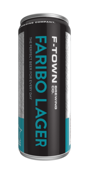
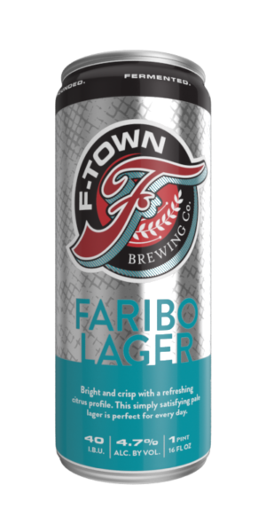
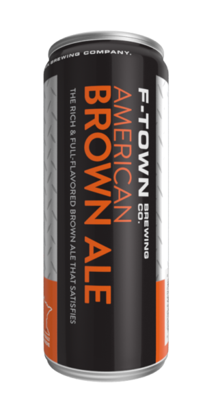
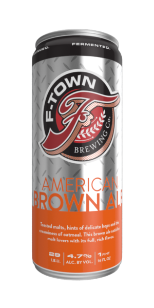
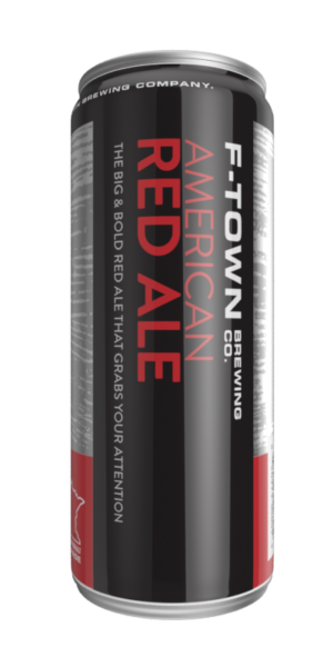
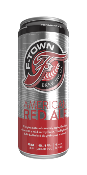
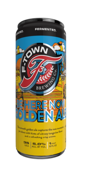
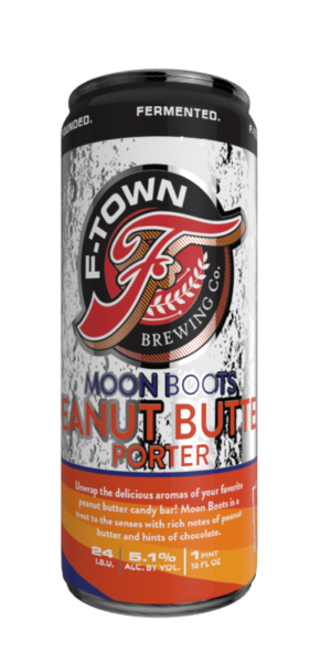
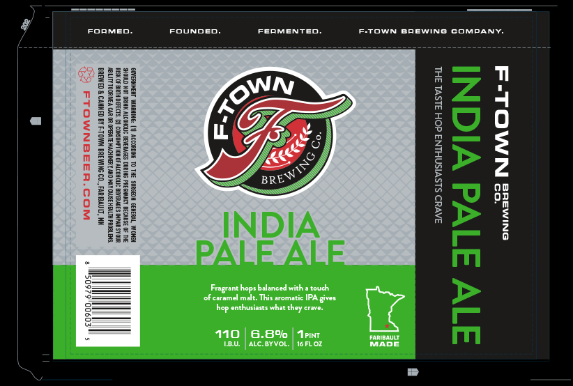
When launching a new product line, it’s important to make your product stand out. Especially in the visually crowded retail liquor setting, where there’s lots of competition for shelf space and loyal consumers. For F-Town Brewing, we created a “master brand” package architecture system; one that repeats the major brand elements and customizes the flavor cues with color and pattern variations.
Billboard the flavor
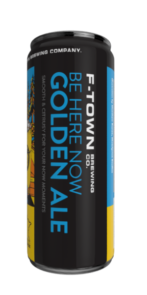
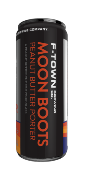
We learned from in-store research that selling environments (beer coolers) are often dimly lit and cluttered, with all the other craft beers competing for attention. Our design approach is bold and uncluttered, with a prominent logo to promote brand awareness and a “billboard” on the side to broadcast the flavor.
Line extensions
The “master brand” branding approach allows for the seamless integration of seasonal flavors into the core line of products.

