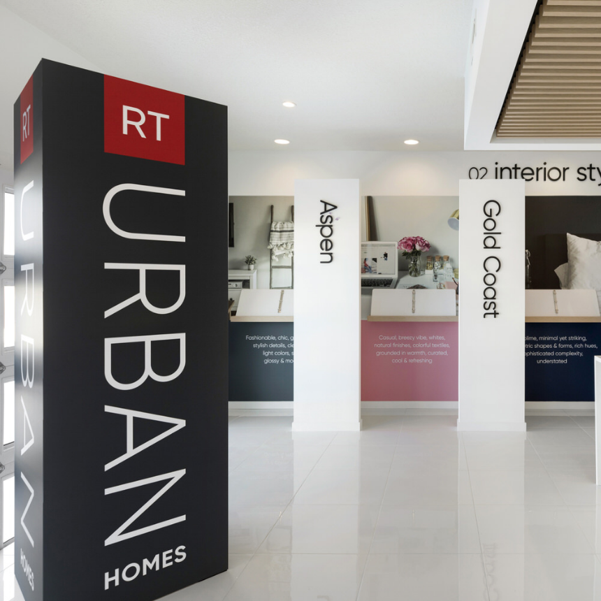
Design Center

Design Center

In partnership with RT Urban Homes, we designed and created sales and design centers to help customers and new home consultants navigate the process of building new homes. The easy to follow sales proess was brought to life through a series of design alcoves, each showcasing an interior style and the options and upgrades available within each package

Client: RT Urban Homes
Category: Branding, Environmental Design

Team Focus

Team Focus

Our challenge was to create a visual identity of Midwest Doulas to match the quality of care their team provides to Twin Cities families to be. Finding a birth doula can be a daunting challenge for a mom-to-be in a confusing and competitive industry. The crowded market has a broad range of personalities and service offerings.

Their team-centric approach, along with the quality of care sets them apart. The Brandlove Effect knew after meeting the owners that a sophisticated, system was needed to both match their elegant styles, professional approach, and playful personalities.

Client: Midwest Doulas
Category: Branding, Print, Web

Branding + Web

During the discovery phase, we learned why they both are so passionate about what they do – seeing the moment when a family grows as a child is introduced into the world and a bond is made. We also knew that special time is fleeting and was important to capture.

Our design solution is a fusion of everything we learned: the owners’ sophisticated style, the joy of their clients as new family members arrive into their lives, and the simple joy of laughter.  We combined simple shapes to create bold patterns with a soft appeal and touch. We selected images that feel clean, current and emphasizes the family bond.  The messaging is simple direct and clear. The result communicates just what they wanted — that they support and care for their clients unconditionally, and that their whole team is there for them through their birth journey.

Grow Boldly!

Grow Boldly!

In partnership with The Growth Collaborative, we created a virtual workshop designed to help entrepreneurs and business leaders re-energize and kickstart their growth. The vibrant palette and graphics of the brand and website signal the rewards seminar participants will reap—momentum, excitement and business growth

Client: Entrepreneurial Intensives
Category: Branding, Web+Social, Print+Packaging

Promotion

Animated gifs for social media channels highlight the challenges entrepreneurs face and the topics addressed by the seminar.

Course Materials

Course materials are designed for maximum clarity and ease of use for the participants. Ample margins provide space for note-taking during the “debrief and discussion” sessions of the course.

Imperial Debut

Imperial Debut

Imperial Debut

F-Town’s Imperial Maple Stout bomber package holds a special place in our hearts here at The Brandlove Effect. Historically, Imperial stouts were brewed by English brewers for the Russian Czars, and our regal package design salutes the Empire with rich tones of gold, carmine red, and black. To honor the southern Minnesota sugar maples who contributed their sap to the brew, a pattern of maple leaves forms the background.

Client: F-Town Brewing Co.
Category: Branding, Print+Packaging, Social

Branding & social

A full court of branded elements accompanied the launch of the seasonal celebrity in the Twin Cities market: social media, apparel, and even tap handles for the distribution channels.

Forever Summer

Forever Summer

As Minnesotans, we love spending long relaxing days at the cabin or lake. To promote F-Town’s seasonal beer, we teamed up with Motelprint Studios to create an original poster design that celebrates those beautiful summer days, with a beer, of course.

Client: F-Town Brewing Co.
Category: Print+Packaging, Web+ Social

Branding + Promotion

Originally conceived as a giveaway item to launch the 2016 draft-only beer, the Forever Summer poster captures the golden hue of the beer and the fleeting moments of a beautiful Minnesota summer.

Package Design + Promotion

Forever Summer returned in the summer of 2017, recast as the packaged product Be Here Now Golden Ale. The original poster artwork was re-engineered for use on the package and social media promotional ads.

Data Flow

Data Flow

Endeveran is an IT organization that designs complex data systems for state-of-the-art cloud-based sales applications. The visual identity development was inspired by concepts of fluid dynamics and data flow models to depict the ever-changing nature of data in the cloud.

Client: Endeveran
Category: Branding, Print+Packaging

Website video header

To capture the abstract idea of making data connections, we created this video header featuring a plexus-style background, and layered the animated custom-designed typography and data logo.

[rev_slider alias=”enderveran1″]

Sales Materials

The printed sales collateral is devised to be hard-working and flexible. An embossed outer folder holds an overview brochure, personalized letter, business card and interchangeable inserts.

Wagging W

Wagging W

Wagging W

There’s no better example of The Brandlove Effect in action than at Wagging Tails Pet Resort. For the past several years, we’ve been transforming the resort’s branding, customer experience, and communications strategy to convey the joy and love of dogs they share with their furry guests and their families.

Client: Wagging Tails Pet Resort
Category: Branding, Web+ Social, Print+Packaging

Web + Social

As part of a yearly marketing plan, we craft blog posts, create custom content, and initiate seasonal promotions to keep resort customers engaged. And our Birthday Club photography, featuring the dogs in custom bandanas and party hats, brightens the social media feeds.

Customer Communications

Designed to be self-contained and efficient, the Wagging Tails collateral system combines an overview brochure and half-sheet inserts—all tucked into a pint-sized pocket folder. Beautiful and smart.

Environment

Starting in the main lobby and working through the playspaces, the entire Resort is energized with bold color blocking, oversized patterns, and dynamic graphics.

Promotion

Several times a year we organize promotions that encourage customer engagement and support local causes. The Resort’s Cuts for the Cure and Holiday Giving Tree have generated thousands of dollars for charity. We’re happy to share the belly rubs!

Strength

Strength

Strength

Minnesota Northwoods lore inspired the branding solution for BlueOx Plywood. The modern lumberjack-plaid coloration and stylized blue ox express the product attributes of strength, resilience, water resistance, and good old Minnesota integrity.

Client: Blue Ox Plywood
Category: Branding, Print+Packaging, Web+Social

Branding + Website + Sales Kit

The sales kit and companion website drive the marketing efforts of this new concrete-casting product. Custom icons and a custom-printed product sample feature prominently in the kit and on all sales pieces.

“F” is for Family

“F” is for Family

“F” is for Family

When launching a new product line, it’s important to make your product stand out. Especially in the visually crowded retail liquor setting, where there’s lots of competition for shelf space and loyal consumers. For F-Town Brewing, we created a “master brand” package architecture system; one that repeats the major brand elements and customizes the flavor cues with color and pattern variations.

Client: F-Town Brewing Co.
Category: Branding, Print+Packaging

Billboard the flavor

We learned from in-store research that selling environments (beer coolers) are often dimly lit and cluttered, with all the other craft beers competing for attention. Our design approach is bold and uncluttered, with a prominent logo to promote brand awareness and a “billboard” on the side to broadcast the flavor.

Line extensions

The “master brand” branding approach allows for the seamless integration of seasonal flavors into the core line of products.